Mobile Commerce Optimisation: 6 Essential Steps for US E-commerce to Boost Conversions by 18% This Year

Mobile Commerce Optimisation: 6 Essential Steps for US E-commerce to Boost Conversions by 18% This Year
In the dynamic landscape of modern retail, mobile commerce optimisation is no longer an option but a critical imperative for US e-commerce businesses. With smartphones becoming the primary device for online shopping, optimising your mobile presence can dramatically impact your conversion rates. Industry reports consistently show that a significant portion of online purchases in the US now originate from mobile devices, yet many e-commerce sites still struggle to provide an optimal mobile experience. This article delves into six essential steps that US e-commerce businesses can implement to significantly enhance their mobile commerce optimisation efforts, aiming for an ambitious 18% boost in conversions this year.
The rise of mobile shopping has reshaped consumer expectations. Shoppers demand speed, convenience, and a seamless experience, regardless of the device they use. Failing to meet these expectations can lead to high bounce rates, abandoned carts, and ultimately, lost revenue. For US e-commerce companies, understanding and mastering mobile commerce optimisation is key to unlocking substantial growth in a highly competitive market.
We’ll explore actionable strategies ranging from enhancing user experience and site speed to streamlining the checkout process and leveraging mobile-specific features. Each step is designed to address common pain points in mobile shopping and provide a clear path towards improved customer satisfaction and increased sales. By meticulously implementing these recommendations, you can transform your mobile site into a powerful conversion machine, ensuring your business thrives in the mobile-first era.
1. Prioritise a Flawless Mobile-First User Experience (UX)
The foundation of successful mobile commerce optimisation lies in an exceptional mobile-first user experience. This isn’t just about making your website responsive; it’s about designing your entire e-commerce journey with the mobile user in mind from the ground up. A mobile-first approach ensures that the core functionalities, content, and design elements are prioritised for smaller screens, leading to a more intuitive and efficient shopping experience.
Responsive Design vs. Mobile-First Design
While responsive design adapts your desktop site to mobile screens, mobile-first design starts with the mobile experience and scales up to larger screens. This subtle but crucial difference ensures that mobile users are not getting a watered-down version of your site but a tailored experience that caters to their unique needs. For US e-commerce, where mobile usage is pervasive, a mobile-first philosophy is paramount.
Key Elements of Flawless Mobile UX:
- Intuitive Navigation: Mobile users need simple, easy-to-use navigation. Think hamburger menus, sticky headers, and clear calls to action. Avoid cluttered menus and excessive scrolling. Products should be easily discoverable within a few taps.
- Thumb-Friendly Design: Most mobile users interact with their devices using their thumbs. Design elements like buttons, links, and forms should be large enough and strategically placed within easy reach of the thumb zone. This reduces accidental clicks and improves usability.
- Readable Content: Use clear, legible fonts and ensure sufficient contrast between text and background. Break up large blocks of text into smaller, digestible paragraphs. Utilise bullet points and headings to improve readability on smaller screens.
- Optimised Forms: Mobile forms can be a major drop-off point. Simplify forms by asking only for essential information. Use auto-fill features, numerical keyboards for number fields, and clear error messages to guide users.
- Visual Appeal: High-quality product images and videos are crucial. Ensure they load quickly and are optimised for mobile screens, allowing users to zoom and see details without compromising performance.
By focusing on these elements, US e-commerce businesses can create a mobile experience that feels natural and effortless, encouraging exploration and increasing the likelihood of conversion. This dedication to mobile-first UX is a cornerstone of effective mobile commerce optimisation.
2. Supercharge Your Mobile Site Speed and Performance
In the world of mobile commerce, speed is currency. Research continually shows that even a one-second delay in page load time can lead to a significant drop in conversions and a higher bounce rate. For US e-commerce businesses aiming to boost conversions by 18%, optimising mobile site speed and performance is a non-negotiable step in their mobile commerce optimisation strategy.
Why Speed Matters More on Mobile:
Mobile users are often on the go, using varying network conditions, and have limited patience. A slow-loading site frustrates them, leading them to abandon their shopping journey for a faster competitor. Google also prioritises fast-loading sites in its mobile search rankings, making speed crucial for both user experience and SEO.
Key Strategies for Speed Optimisation:
- Image Optimisation: This is often the biggest culprit for slow page loads. Compress images without sacrificing quality. Use modern formats like WebP. Implement lazy loading, so images only load when they are visible in the user’s viewport.
- Minify CSS, JavaScript, and HTML: Remove unnecessary characters, comments, and whitespace from your code to reduce file sizes and improve loading times.
- Leverage Browser Caching: Allow browsers to store parts of your website (like logos, stylesheets, and scripts) so they don’t have to be re-downloaded every time a user visits.
- Reduce Server Response Time: A fast server response time is critical. This can be improved by using a robust hosting provider, optimising database queries, and employing Content Delivery Networks (CDNs) to deliver content from servers geographically closer to your users.
- Prioritise Above-the-Fold Content: Ensure that the content visible on the initial screen loads first. This gives users immediate engagement and makes the site feel faster, even if other elements are still loading in the background.
- Eliminate Render-Blocking Resources: Identify and eliminate JavaScript and CSS that prevent your page from rendering quickly.
- Regular Performance Audits: Utilise tools like Google PageSpeed Insights, Lighthouse, and GTmetrix to regularly monitor your mobile site’s performance, identify bottlenecks, and track improvements.
By making your mobile site lightning fast, US e-commerce businesses can significantly reduce abandonment rates, improve user satisfaction, and directly contribute to higher conversion rates, solidifying their mobile commerce optimisation efforts.
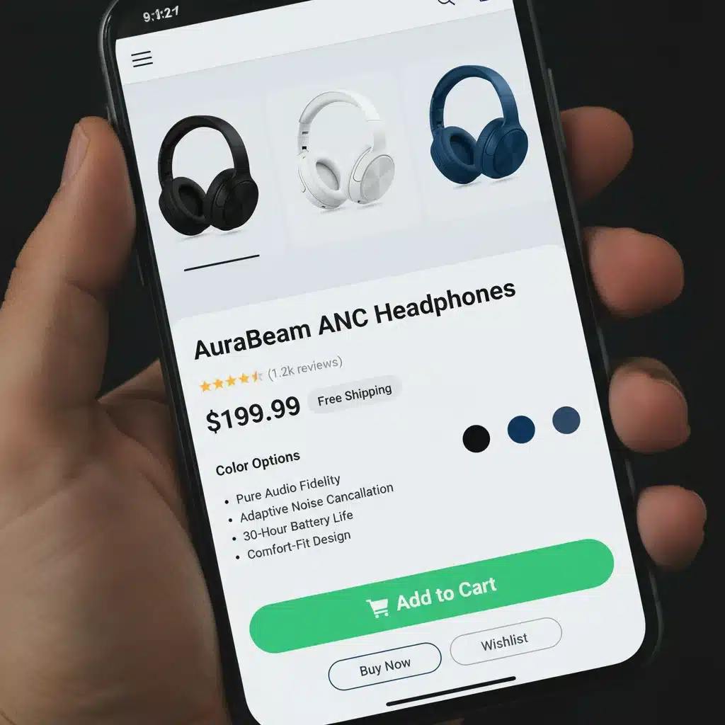
3. Streamline the Mobile Checkout Process
The checkout process is the final hurdle in the customer journey, and for mobile users, it needs to be as frictionless as possible. A complicated, lengthy, or insecure mobile checkout is a primary reason for cart abandonment. Effective mobile commerce optimisation demands a streamlined, intuitive, and secure checkout experience that caters specifically to the constraints and preferences of smartphone users.
Why Checkout Optimisation is Crucial for Mobile Conversions:
Mobile users often make purchases on the go, with limited time and attention. They expect a quick, straightforward path to purchase. Any obstacle, from excessive form fields to unclear shipping options, can lead to immediate abandonment. For US e-commerce, where competition is fierce, a superior mobile checkout can be a significant differentiator.
Tactics for a Seamless Mobile Checkout:
- Guest Checkout Option: Do not force users to create an account before purchasing. Offer a prominent guest checkout option. While account creation can be beneficial for repeat business, it’s a barrier for first-time or casual shoppers on mobile.
- One-Page Checkout (or Accordion Style): Consolidate the checkout process into as few steps as possible. A single-page checkout, or an accordion-style checkout that expands sections as users progress, minimises navigation and keeps all relevant information in view.
- Auto-Fill Functionality: Leverage browser auto-fill for addresses and payment details. This significantly reduces typing on small keyboards, accelerating the process and reducing errors.
- Mobile-Friendly Payment Options: Integrate popular mobile payment solutions like Apple Pay, Google Pay, PayPal, and Shop Pay. These options allow users to complete purchases with a single tap or biometric authentication, bypassing manual entry altogether.
- Clear Progress Indicators: If a multi-step checkout is unavoidable, provide clear visual cues (e.g., a progress bar) to show users where they are in the process and how many steps remain.
- Large, Tappable Buttons: Ensure all calls to action, especially ‘Continue’ or ‘Place Order’ buttons, are large, prominent, and easy to tap with a thumb.
- Minimise Data Entry: Only ask for absolutely essential information. Pre-populate fields where possible and use smart defaults. For example, if billing and shipping addresses are often the same, provide a checkbox for this.
- Visual Trust Signals: Display security badges, trusted payment logos, and customer support contact information prominently to reassure users about the security of their transaction.
By perfecting the mobile checkout, US e-commerce businesses can significantly reduce cart abandonment rates and convert more browsing sessions into completed sales, directly contributing to their mobile commerce optimisation goals.
4. Implement Robust Mobile Security and Trust Signals
Trust is the bedrock of online commerce, and nowhere is it more critical than on mobile devices. Consumers are increasingly wary of sharing personal and financial information on smartphones, especially with the prevalence of cyber threats. For US e-commerce businesses, building and maintaining robust mobile security, coupled with clear trust signals, is an indispensable component of effective mobile commerce optimisation. Without trust, even the most perfectly designed mobile site will struggle to convert.
The Importance of Mobile Security for Conversions:
A lack of perceived security can lead to high abandonment rates at critical stages, particularly during checkout. Mobile users need reassurance that their data is protected. A secure site not only protects your customers but also safeguards your brand reputation and complies with evolving data privacy regulations.
Key Security and Trust Signal Strategies:
- HTTPS Encryption (SSL Certificate): This is fundamental. Ensure your entire site, especially all pages where sensitive information is entered (login, registration, checkout), is secured with an SSL certificate. This encrypts data transmitted between the user’s device and your server, making it unreadable to third parties. Displaying a padlock icon in the browser address bar is a universal trust signal.
- PCI DSS Compliance: If you handle credit card information directly, ensure your payment processing systems are Payment Card Industry Data Security Standard (PCI DSS) compliant. Even if you use a third-party payment gateway, understanding their compliance is crucial.
- Reputable Payment Gateways: Integrate well-known and trusted payment gateways like Stripe, PayPal, Square, or Braintree. Users are more likely to complete a purchase when they recognise and trust the payment provider.
- Display Trust Badges and Security Seals: Prominently display security badges from reputable providers (e.g., McAfee Secure, Norton Secured, Trustpilot, BBB) on product pages, cart pages, and especially during checkout. These visual cues instantly communicate a commitment to security.
- Clear Privacy Policy and Terms of Service: Make your privacy policy and terms of service easily accessible and understandable. Clearly articulate how customer data is collected, stored, and used. Transparency builds trust.
- Customer Reviews and Testimonials: Social proof is a powerful trust signal. Display customer reviews, ratings, and testimonials on product pages. This shows potential buyers that others have had positive experiences with your products and service.
- Secure Login and Account Management: For returning customers, ensure secure login procedures, potentially offering two-factor authentication. Clearly communicate how their account information is protected.
- Responsive Customer Support: Provide easily accessible customer support options (e.g., live chat, phone number, email) directly on mobile. Knowing that help is available if issues arise builds confidence.
By prioritising robust security measures and effectively communicating them through clear trust signals, US e-commerce businesses can significantly reduce anxiety, build confidence, and drive more conversions through their mobile commerce optimisation efforts.

5. Leverage Mobile-Specific Features and Technologies
Beyond simply making your website accessible on mobile, true mobile commerce optimisation involves harnessing the unique capabilities of smartphones and mobile technologies to create a richer, more engaging, and convenient shopping experience. For US e-commerce, this means tapping into features that enhance discovery, simplify interaction, and personalise the customer journey, ultimately driving that 18% conversion boost.
The Power of Mobile-Native Functionality:
Smartphones offer a suite of built-in features that traditional desktop browsing cannot. Integrating these into your e-commerce strategy can provide a competitive edge and make the mobile shopping experience far more intuitive and enjoyable.
Key Mobile-Specific Integrations:
- Push Notifications: For users who have opted in, push notifications can be incredibly effective for re-engaging customers. Use them strategically for abandoned cart reminders, order status updates, new product launches, or personalised promotions. Avoid over-sending to prevent annoyance.
- Location-Based Services: For brick-and-mortar stores with an online presence, leverage GPS to offer location-specific promotions, store locators, local inventory checks, or curbside pickup options. This bridges the gap between online and offline shopping.
- Augmented Reality (AR): AR can revolutionise product visualisation. Allow customers to virtually ‘try on’ clothes, ‘place’ furniture in their homes, or preview products in their environment. This reduces uncertainty and significantly enhances the pre-purchase experience, especially for US consumers looking for innovative shopping solutions.
- Voice Search Optimisation: With the rise of voice assistants (Siri, Google Assistant, Alexa), optimising your product descriptions and site search for conversational queries is crucial. Users might ask, “Find me a red running shoe size 9” rather than typing keywords.
- Biometric Authentication: Integrate fingerprint or facial recognition for faster and more secure login and checkout processes. This eliminates the need for passwords, reducing friction and enhancing security.
- Click-to-Call/Click-to-Chat: Make it easy for mobile users to contact customer support directly from their device. A prominent click-to-call button or a live chat widget can quickly resolve queries and prevent abandonment.
- Personalised Content and Recommendations: Utilise mobile browsing data to deliver highly personalised product recommendations, promotions, and content. The smaller screen real estate on mobile makes relevant content even more impactful.
- Mobile Wallet Integration: Beyond standard payment gateways, integrate with mobile wallets like Apple Wallet or Google Wallet for loyalty cards, tickets, and even streamlined checkout, further enhancing convenience.
By thoughtfully integrating these mobile-specific features, US e-commerce businesses can create a highly engaging and efficient shopping experience, distinguishing themselves from competitors and driving significant gains in their mobile commerce optimisation efforts.
6. Continuous Testing, Analysis, and Iteration
Mobile commerce is an ever-evolving landscape, and what works today might not be as effective tomorrow. The sixth and arguably most critical step in achieving sustained mobile commerce optimisation and that 18% conversion boost for US e-commerce businesses is the commitment to continuous testing, analysis, and iteration. This data-driven approach ensures that your mobile strategy remains agile, relevant, and consistently optimised for peak performance.
Why Continuous Optimisation is Essential:
Consumer behaviour, technology, and market trends are constantly shifting. What’s more, every audience is unique. What works for one e-commerce site might not work for another. Continuous testing allows you to understand your specific mobile users, identify pain points, validate improvements, and adapt your strategy to maintain a competitive edge.
Key Pillars of Continuous Optimisation:
- A/B Testing (Split Testing): Regularly test different versions of your mobile pages, elements, and flows. This could include testing different button colours, call-to-action texts, product image layouts, checkout form designs, or navigation structures. A/B testing provides concrete data on what resonates best with your mobile audience.
- User Behavior Analytics: Utilise tools like Google Analytics, Hotjar, or Crazy Egg to understand how users interact with your mobile site. Look at metrics such as bounce rate, time on page, conversion funnels, scroll depth, and click maps. Identify areas where users drop off or struggle.
- Heatmaps and Session Recordings: These visual tools provide invaluable insights into mobile user behaviour. Heatmaps show where users tap, scroll, and spend the most time, while session recordings allow you to watch anonymised user sessions to identify frustrating moments or usability issues.
- User Surveys and Feedback: Directly ask your mobile users for their opinions. Implement short, unobtrusive surveys on your site or after a purchase to gather qualitative feedback on their experience. What did they like? What frustrated them? What could be improved?
- Competitor Analysis: Regularly review how your competitors are optimising their mobile experience. What new features are they implementing? What best practices can you learn from? While not directly testing your site, it provides valuable context and inspiration.
- Performance Monitoring: Beyond initial speed optimisation, continuously monitor your site’s performance metrics (page load times, server response) using tools like Google PageSpeed Insights. Performance can degrade over time due to new content, features, or code.
- Regular Content and SEO Audits: Ensure your mobile content remains fresh, relevant, and optimised for mobile search. Regularly review your mobile SEO to ensure you’re ranking well for relevant keywords.
- Iterative Development: Based on your analysis and testing results, make small, incremental changes. Don’t try to overhaul everything at once. Implement a change, test its impact, analyse the results, and then iterate again.
By embedding a culture of continuous testing and improvement, US e-commerce businesses can ensure their mobile commerce optimisation strategy remains cutting-edge, responsive to user needs, and consistently drives higher conversion rates year after year.
Conclusion: Unlocking 18% More Conversions Through Mobile Commerce Optimisation
The journey to achieving an 18% boost in conversions for US e-commerce businesses through mobile commerce optimisation is comprehensive but highly rewarding. The mobile device is no longer just an alternative shopping channel; for many, it is the primary gateway to your brand. By diligently focusing on these six essential steps, businesses can transform their mobile presence from a mere extension of their desktop site into a powerful, revenue-generating engine.
Recap of the 6 Essential Steps:
- Prioritise a Flawless Mobile-First User Experience (UX): Design for the thumb, simplify navigation, and ensure readability.
- Supercharge Your Mobile Site Speed and Performance: Optimise images, minify code, and leverage caching to deliver a lightning-fast experience.
- Streamline the Mobile Checkout Process: Offer guest checkout, use one-page designs, and integrate mobile payment options.
- Implement Robust Mobile Security and Trust Signals: Ensure HTTPS, use trusted payment gateways, and display security badges.
- Leverage Mobile-Specific Features and Technologies: Integrate push notifications, AR, voice search, and biometric authentication.
- Continuous Testing, Analysis, and Iteration: Use A/B testing, analytics, and user feedback to constantly refine and improve.
Each of these steps plays a vital role in creating a holistic and highly effective mobile shopping environment. For US e-commerce businesses, the investment in these mobile commerce optimisation strategies is not just about keeping up with trends; it’s about staying ahead of the curve, meeting evolving customer expectations, and directly impacting your bottom line.
By embracing a mobile-first mindset and committing to ongoing improvements, you not only improve conversion rates but also build stronger customer loyalty and enhance your brand’s reputation in the competitive digital marketplace. Start implementing these strategies today, and watch your US e-commerce conversions soar.